Article
Extracting an accessible color palette from an image
A photograph or brand asset often contains the seed of a full color system. Extracting that seed, shaping it into a usable palette, and then verifying it against accessibility standards requires three distinct steps. This article covers each one in order: how palette extraction works under the hood, how to select and adjust colors for practical use, how to check contrast against WCAG thresholds, and how to catch the pairs that collapse for colorblind users.
How a palette is extracted: pixel sampling and color quantization
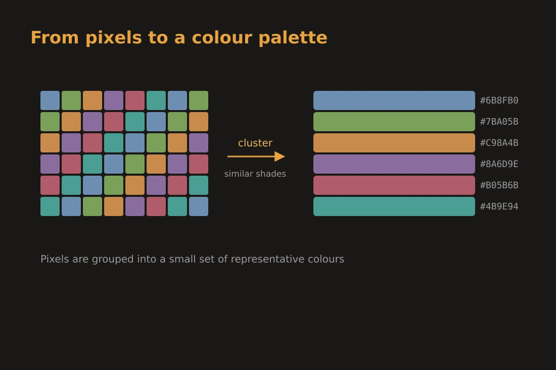
Every digital image is a grid of pixels, each carrying a color value in a space like RGB. A palette extractor does not inspect every pixel individually: a 2-megapixel photo contains 2 million data points, which would be slow to process and would return thousands of slightly different shades rather than a useful set. Instead, the tool samples the pixel grid at a regular interval, collecting a representative subset. That subset is then fed into a color quantization algorithm. The most common approach groups similar colors together using a clustering method, sometimes called median-cut or k-means style partitioning. The algorithm places each sampled pixel into one of a fixed number of buckets based on color similarity, then computes the average color of each bucket. The result is a small list, typically 4 to 16 colors, that together account for the dominant visual tones in the image. Colors that appear only in small isolated areas may be missed, which is expected behavior rather than a flaw.
From raw dominant colors to a usable palette
The raw output of a palette extractor is a list of colors ranked by frequency, but frequency alone does not make a palette. A photograph of a forest will return several greens that are too similar to use in a UI as distinct accents. The practical work is selecting and adjusting. Start by identifying one color as your primary: the one that is most distinctive and least neutral. From the remaining colors, look for at most two that contrast with the primary and with each other. Those become your accents. Everything else, including the desaturated tones the extractor often returns from shadows and mid-tones, can serve as neutrals for backgrounds and borders. Once you have this rough structure, you will almost certainly need to adjust individual values. The color-converter tool lets you examine each color in hex, RGB, and HSL. HSL is particularly useful here: you can hold the hue constant and shift lightness or saturation to create a tighter or looser family without leaving the same color family.
Checking contrast: WCAG thresholds for readable text
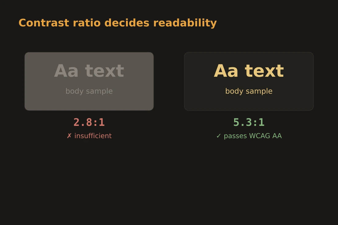
Once you have candidate colors for text and background, you need to check whether the combination is readable. The Web Content Accessibility Guidelines (WCAG) define a contrast ratio for this purpose. The ratio compares the relative luminance of two colors: a value of 1:1 means no contrast at all (same color on same color), and 21:1 is the maximum (black on white). WCAG 2.1 Level AA requires a ratio of at least 4.5:1 for normal-size body text, and 3:1 for large text (18pt or 14pt bold). Level AAA sets higher thresholds of 7:1 and 4.5:1 respectively. You do not need to compute luminance by hand. The key insight is that a color pair which looks fine to you under good lighting may fall below 4.5:1 on screen, and the guideline exists precisely for that case. After extracting and adjusting colors, test every text-on-background pair you plan to use. A mid-tone gray that reads well on white may fail completely on a light beige background from your extracted palette.
Color blindness: simulating how pairs look to affected users
Roughly 1 in 12 men and 1 in 200 women have some form of color vision deficiency. The most common type is deuteranopia (reduced sensitivity to green), followed by protanopia (reduced sensitivity to red). Tritanopia (reduced sensitivity to blue-yellow) is rarer. For each type, the visual system maps certain wavelengths to the same perceived color that unaffected viewers see as distinct. The practical problem for a palette is that two colors which appear clearly different under normal vision can collapse to the same tone for a colorblind user, making them useless for conveying distinction, for example using only red and green to signal success and error. Running a color-blindness simulation shows you what the palette looks like when the affected channels are compressed. The pairs that collapse into a near-identical gray or brown are the ones to reconsider: either increase the lightness difference between them so the contrast remains even without the hue distinction, or add a secondary cue (shape, label, pattern) so color is not the only signal.
Doing it locally: color-palette, color-blindness, and color-converter
All three steps described in this article can be completed without sending your image or brand colors to any server. The color-palette tool runs entirely in the browser: you drop an image, it samples the pixels locally and returns the dominant colors as hex values. No file is transmitted. The color-converter tool accepts a hex code and shows the same color in RGB and HSL so you can make targeted adjustments to lightness or saturation while staying in the same hue family. Both the hex and the converted values exist only in the page. The color-blindness tool works the other way around: you drop an image and it renders deuteranopia, protanopia, and tritanopia simulations of that image, computed in the browser. To check a palette rather than a photo, export or screenshot your swatches as an image first, then drop that into the simulator. Using the three tools in sequence, extract from the image, adjust in color-converter, then export a swatch image and verify it in color-blindness, covers the full workflow described above. Your image stays on your device throughout, which matters if the source photo contains unpublished branding or a client's unreleased identity.
Tools in this article
- Color palette extractorExtract dominant colors from an image as HEX swatches. Copy any color. No upload.
- Color blindness simulatorSimulate protanopia, deuteranopia, tritanopia and achromatopsia on an image. No upload.
- Color ConverterConvert colors between HEX, RGB, HSL, HSV and CMYK. WCAG contrast checker included. No upload.
- Color Scheme GeneratorGenerate complementary, analogous, triadic, tetradic and monochromatic palettes from a base color. No upload.
Frequently asked questions
How many colors does a palette extractor typically return?
Most tools return between 5 and 16 colors by default, though many let you set the count. Returning fewer colors means the algorithm must group more pixels together, which can merge distinct but similar tones. Returning more colors can produce near-duplicates that are difficult to use distinctly. For a UI palette, 6 to 8 colors is usually a practical starting point.
Can a palette extracted from an image automatically pass WCAG contrast?
Not automatically. Dominant colors in a photograph are often mid-tones with moderate luminance, which tend to produce ratios in the 2:1 to 3:1 range against each other. Meeting the 4.5:1 threshold for body text typically requires lightening background values or darkening text values beyond what the raw extraction provides. The extraction gives you a starting point; the contrast check tells you how much adjustment is needed.
Does the WCAG contrast ratio account for color blindness?
Partially. The WCAG luminance formula is based on relative brightness, not hue, so a high-contrast pair that meets 4.5:1 will generally remain distinguishable even to colorblind users because the lightness difference is preserved. However, two colors with similar luminance but different hues, such as red and green at the same brightness, can pass a luminance-based contrast check while still being indistinguishable to deuteranopes. Running a colorblindness simulation is the correct way to check hue-level differentiation separately from the contrast ratio.